
Behind the scenes of the book cover creation process for a children's adventure/mystery trilogy.
Dive in with me!
---------------------------------------------------
---------------------------------------------------

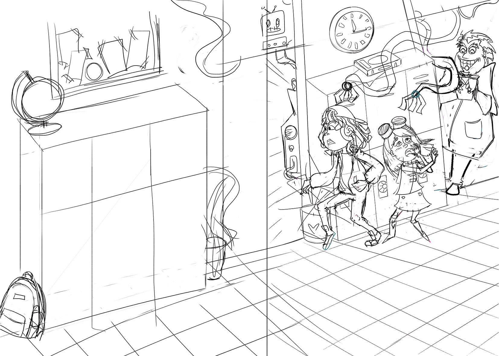
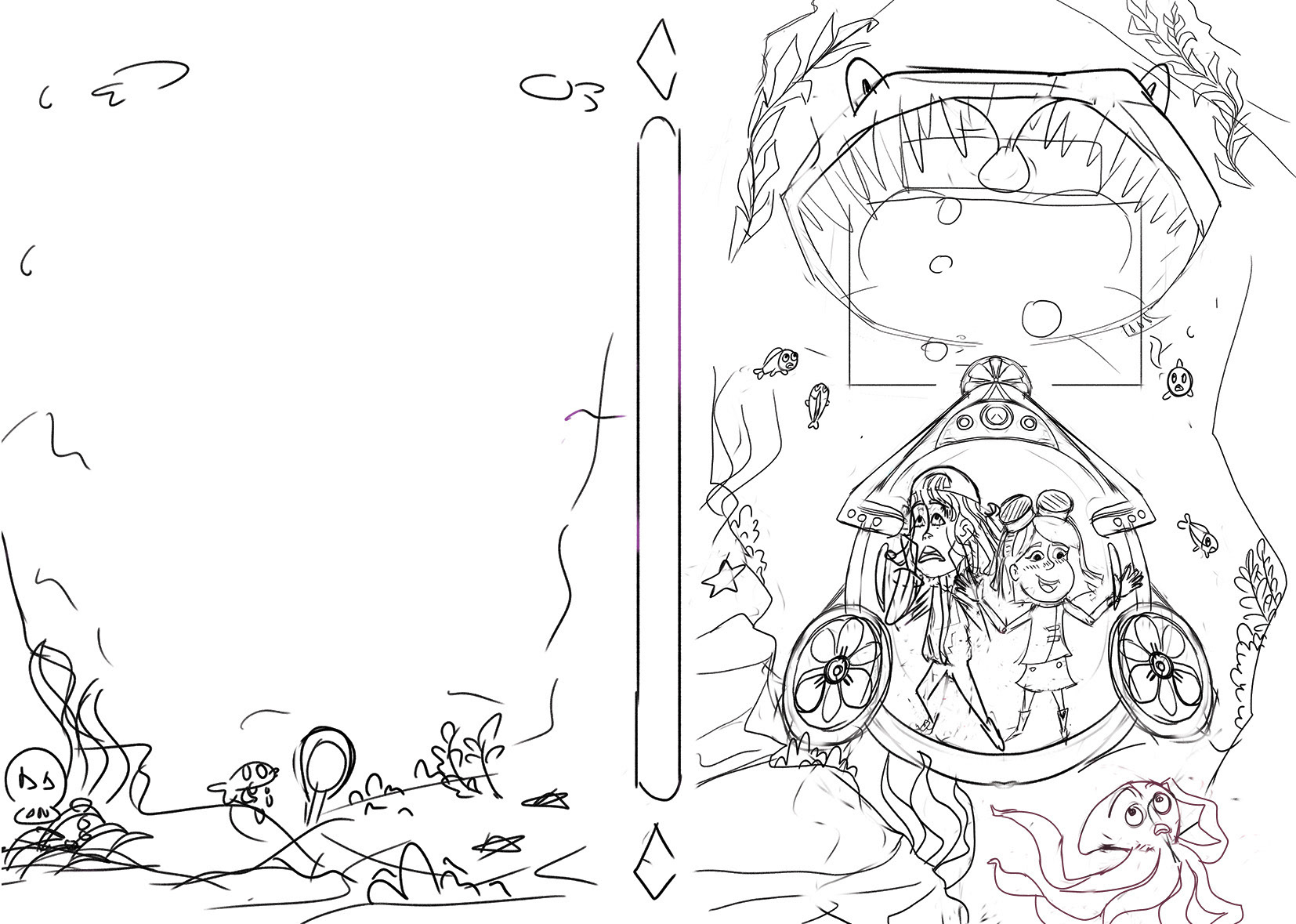
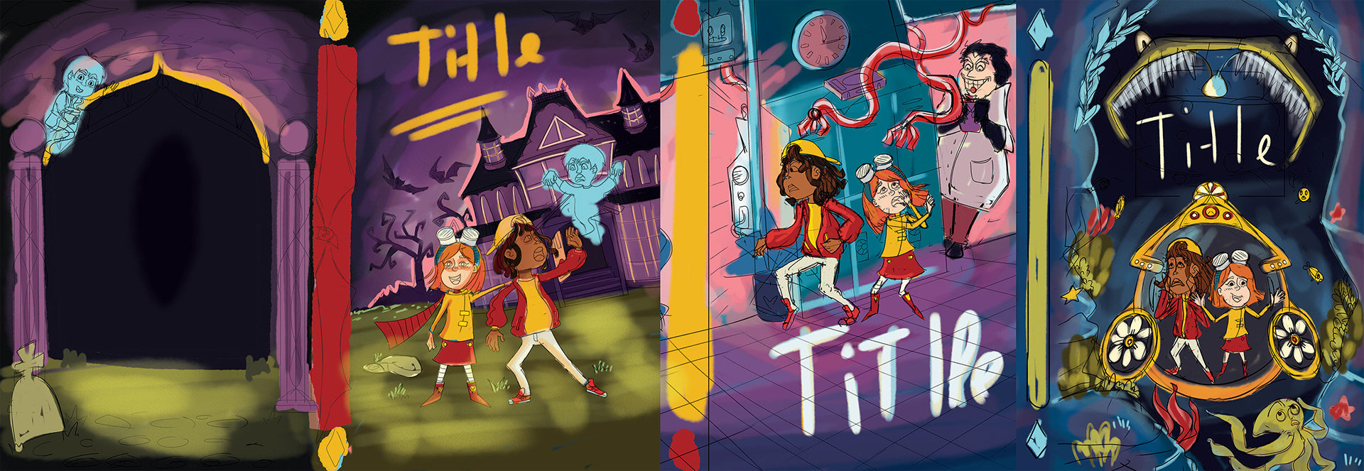
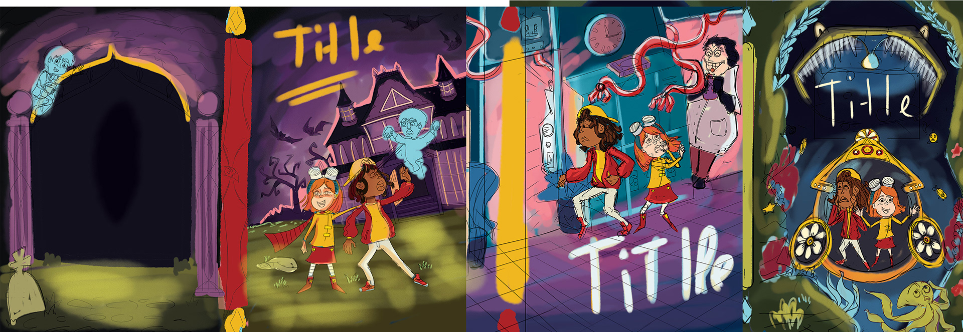
The first step was creating sketches based on the blurb and the design brief. From there, I focused on choosing a color palette that reflects the theme of each book while ensuring all three covers work cohesively as a trilogy.
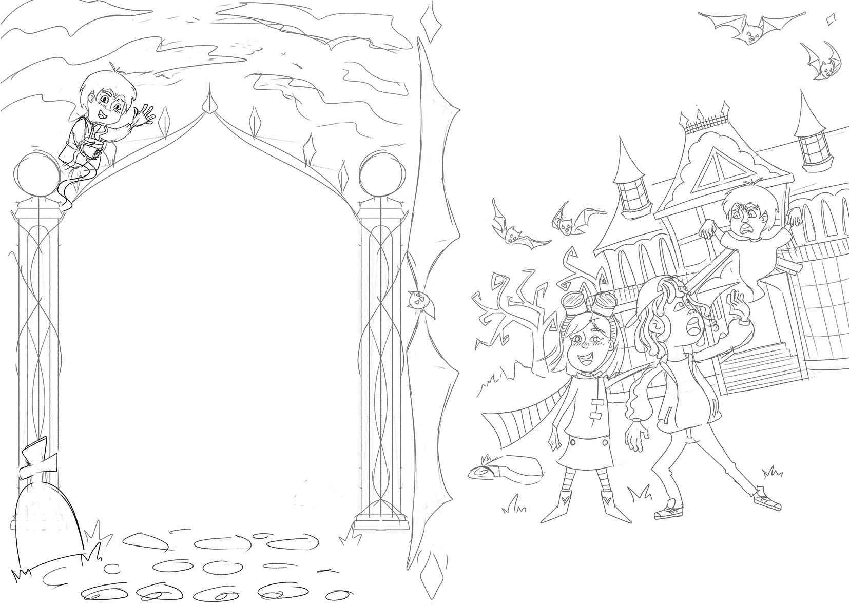
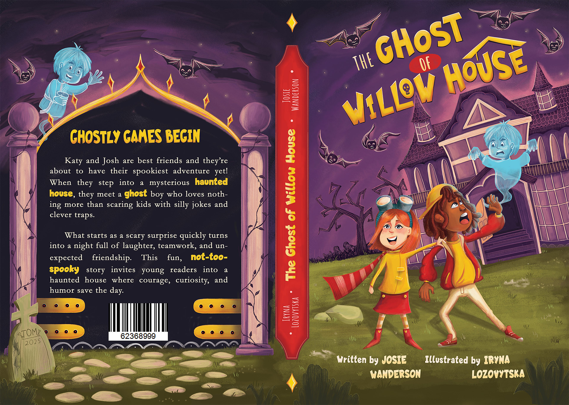
Book One
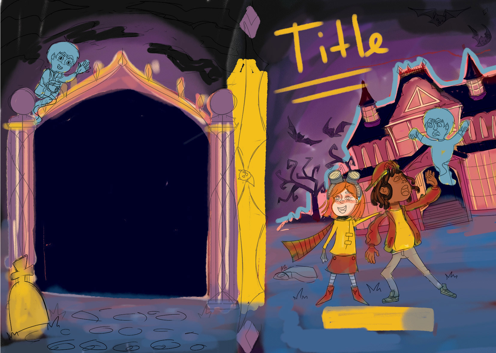
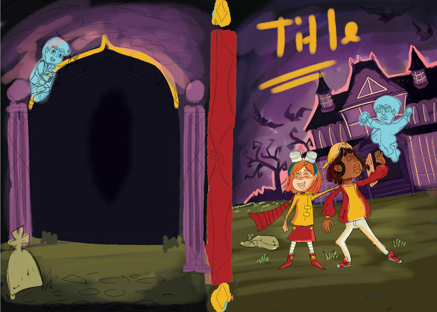
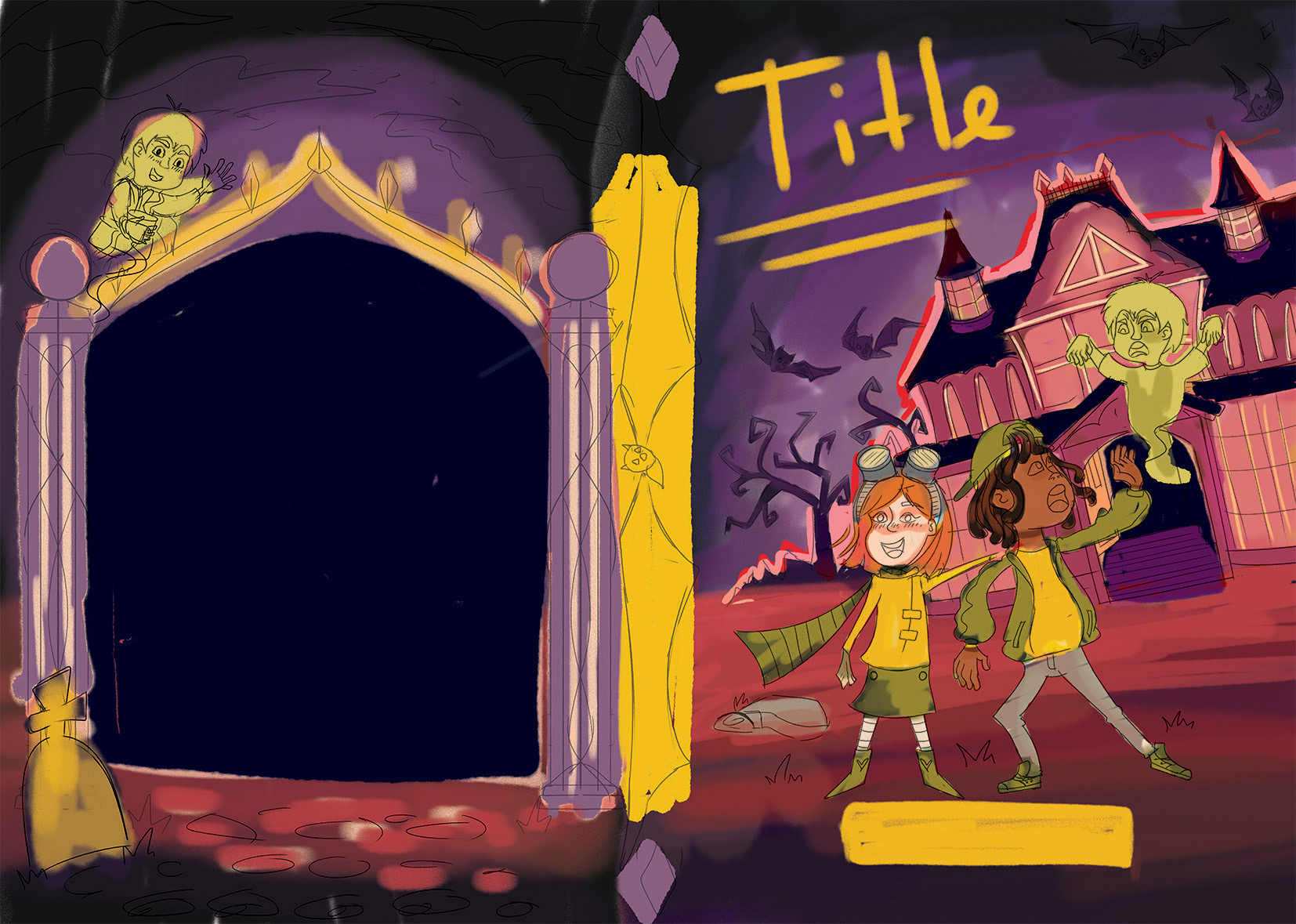
I wanted to capture the mystery of the scene using purple tones, keeping the focus on the character through contrasting yellow and red accents. I then experimented with various colors for the surroundings to find the perfect balance.
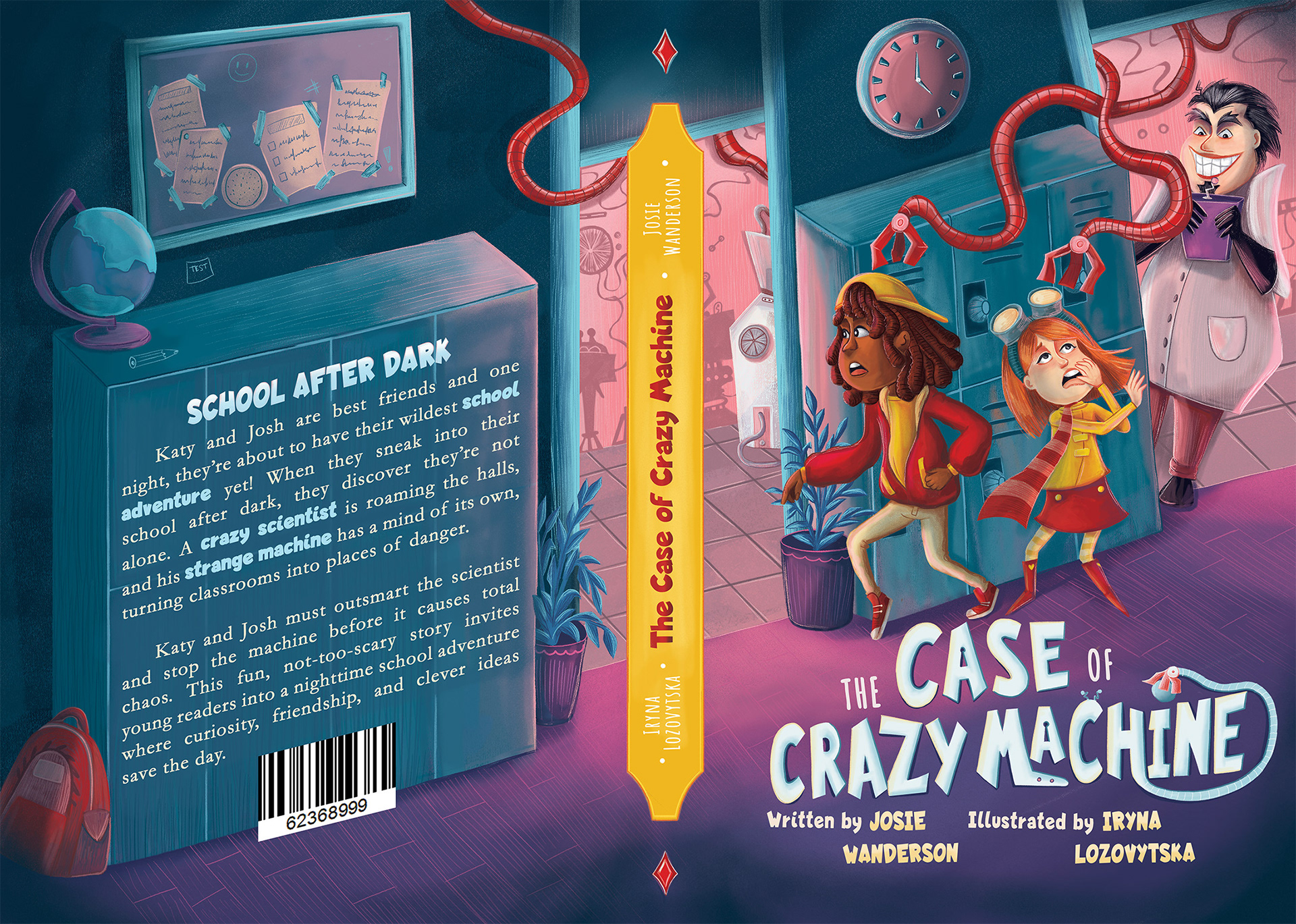
Book Two
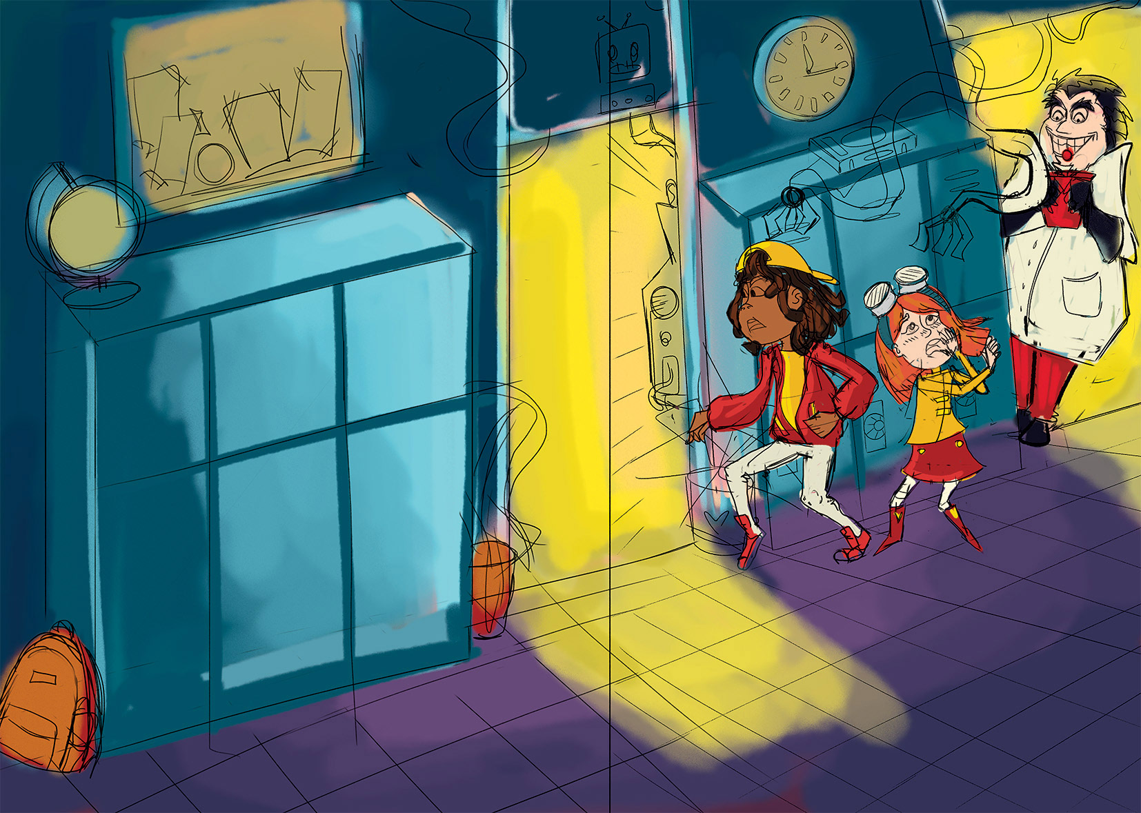
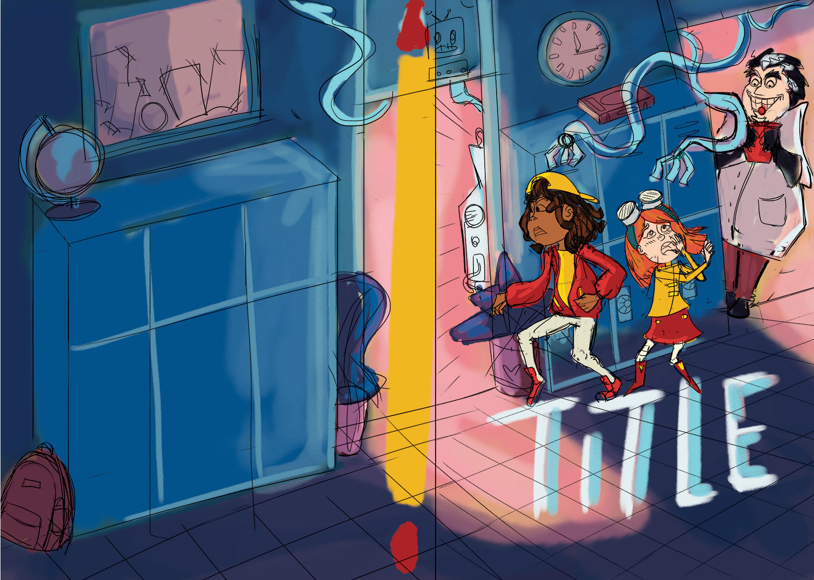
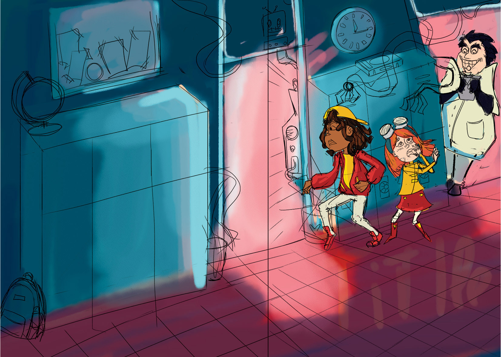
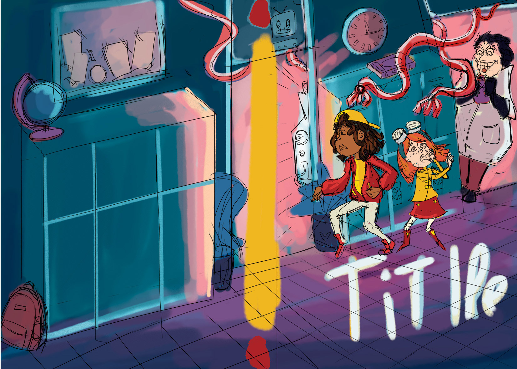
The scene is set at a school at night, where a mad scientist has created a robotic machine. I felt that deep blue tones were a must for this cover. To create an eerie, unsettling atmosphere, I contrasted the blues with cold pinks and greens.
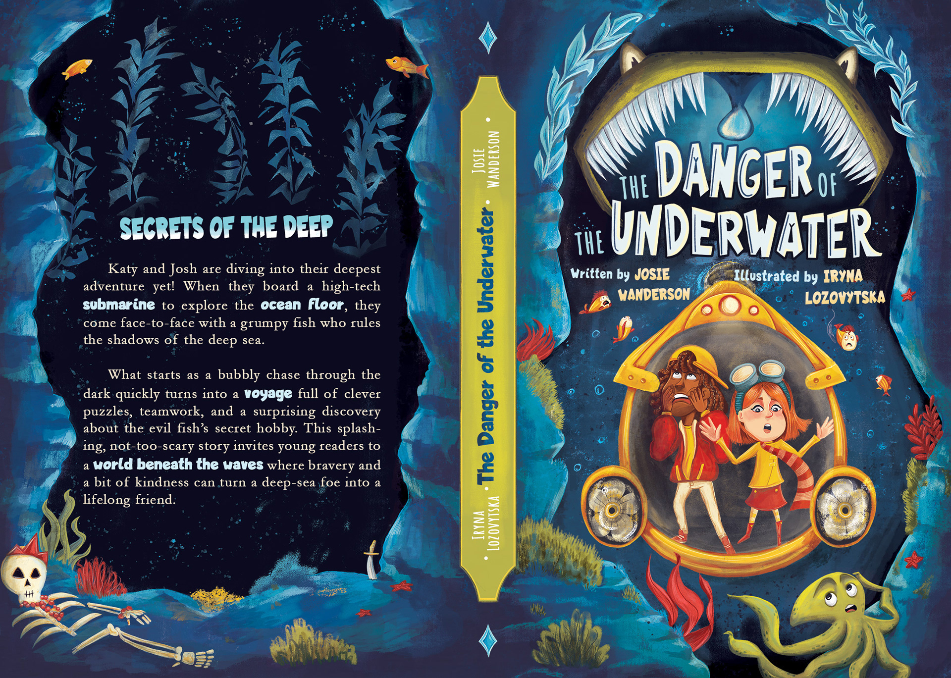
Book Three
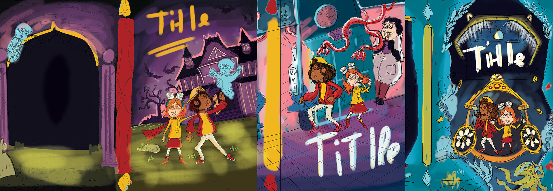
The final book takes place underwater, featuring a monstrous fish as the antagonist. This was quite a challenge. I had to convey the deep sea setting while keeping the palette cohesive with the previous designs. After experimenting with blues, greens, purples, and even yellows, I ultimately decided on a blend of rich blues and navy tones.
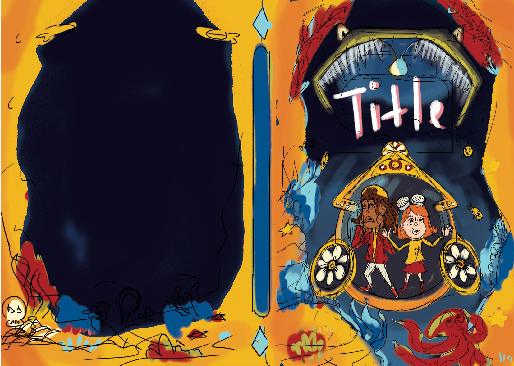
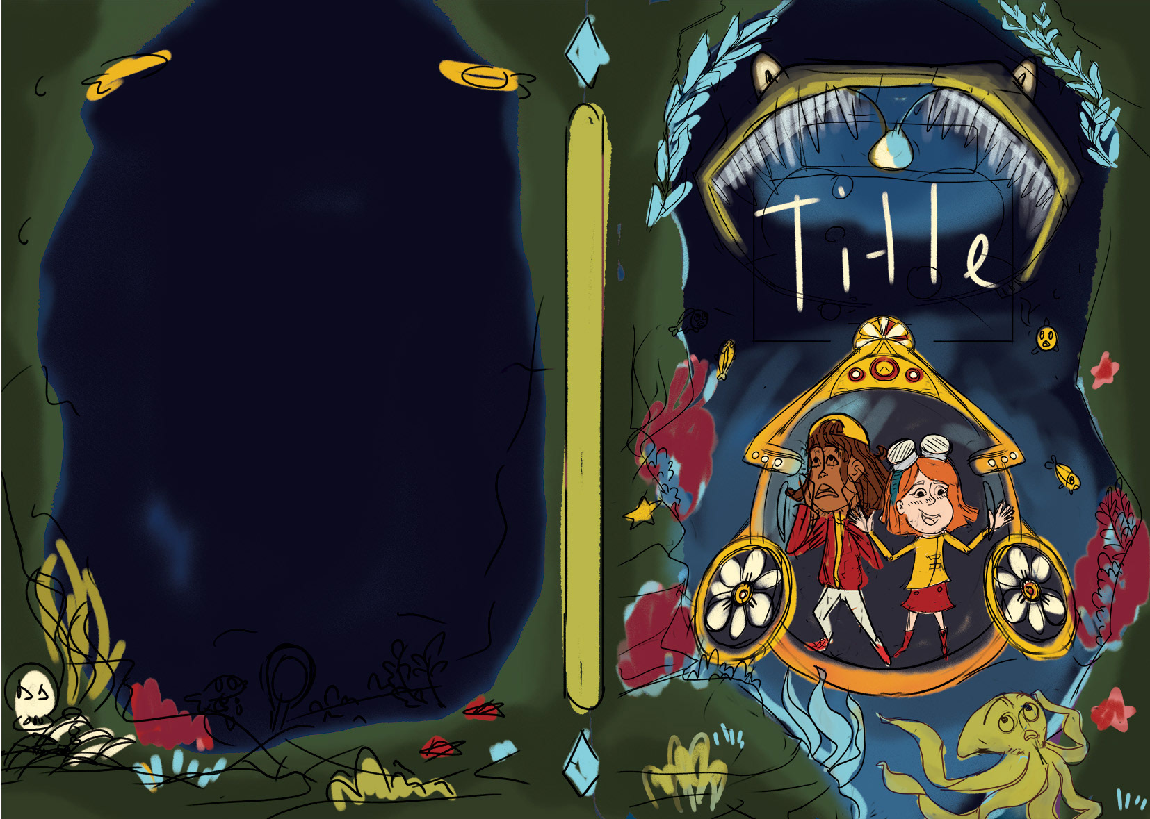
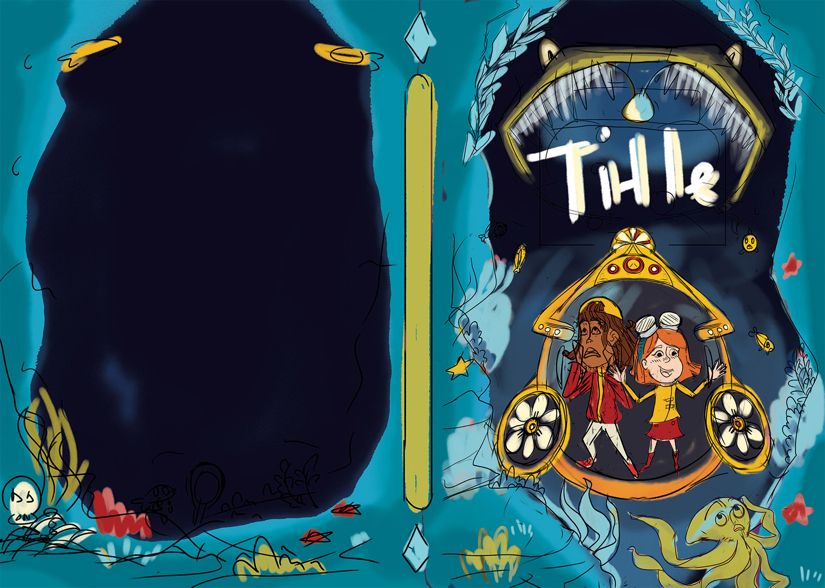
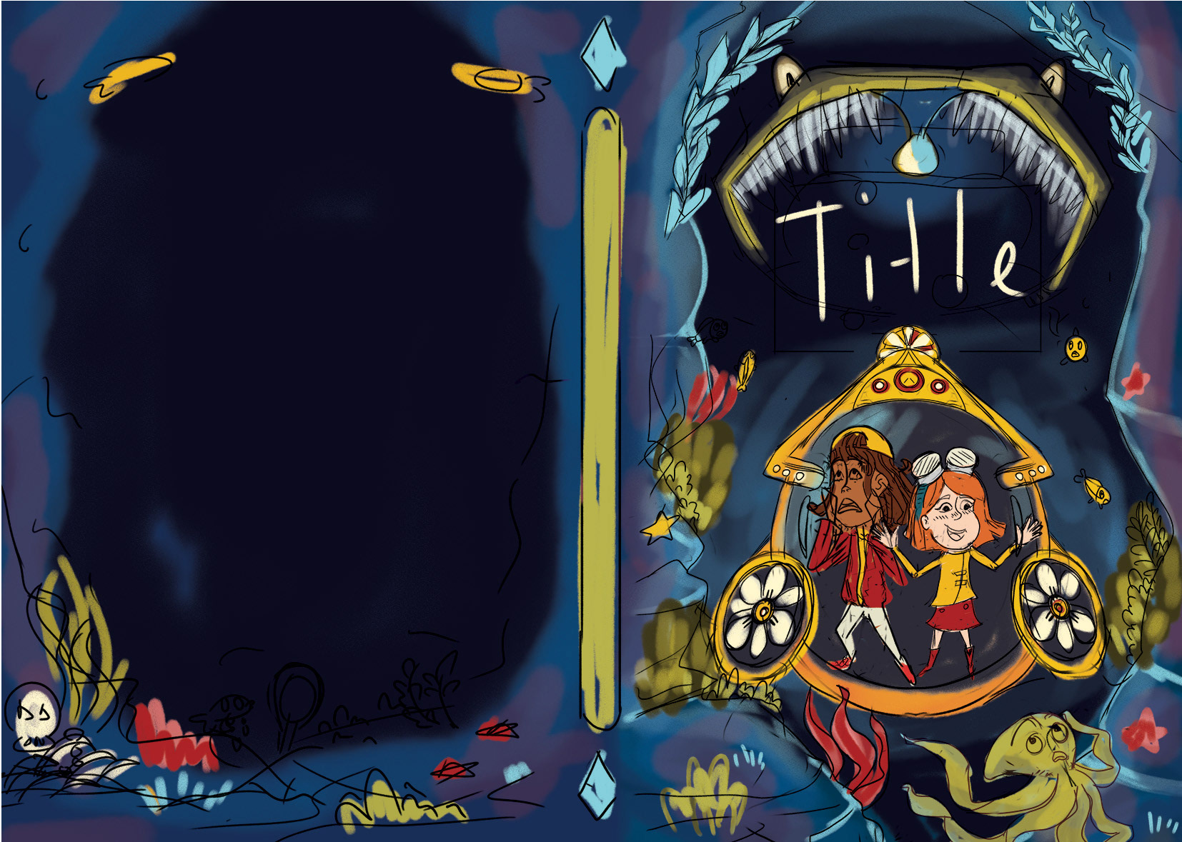
So, here are some examples of how I checked if the third book's color palette works with the others. I visually spotted that the blue ones work the best. I previously dismissed the yellow palette because it made the book look too joyful rather than scary.
Here is a sneak peek at the final book covers!


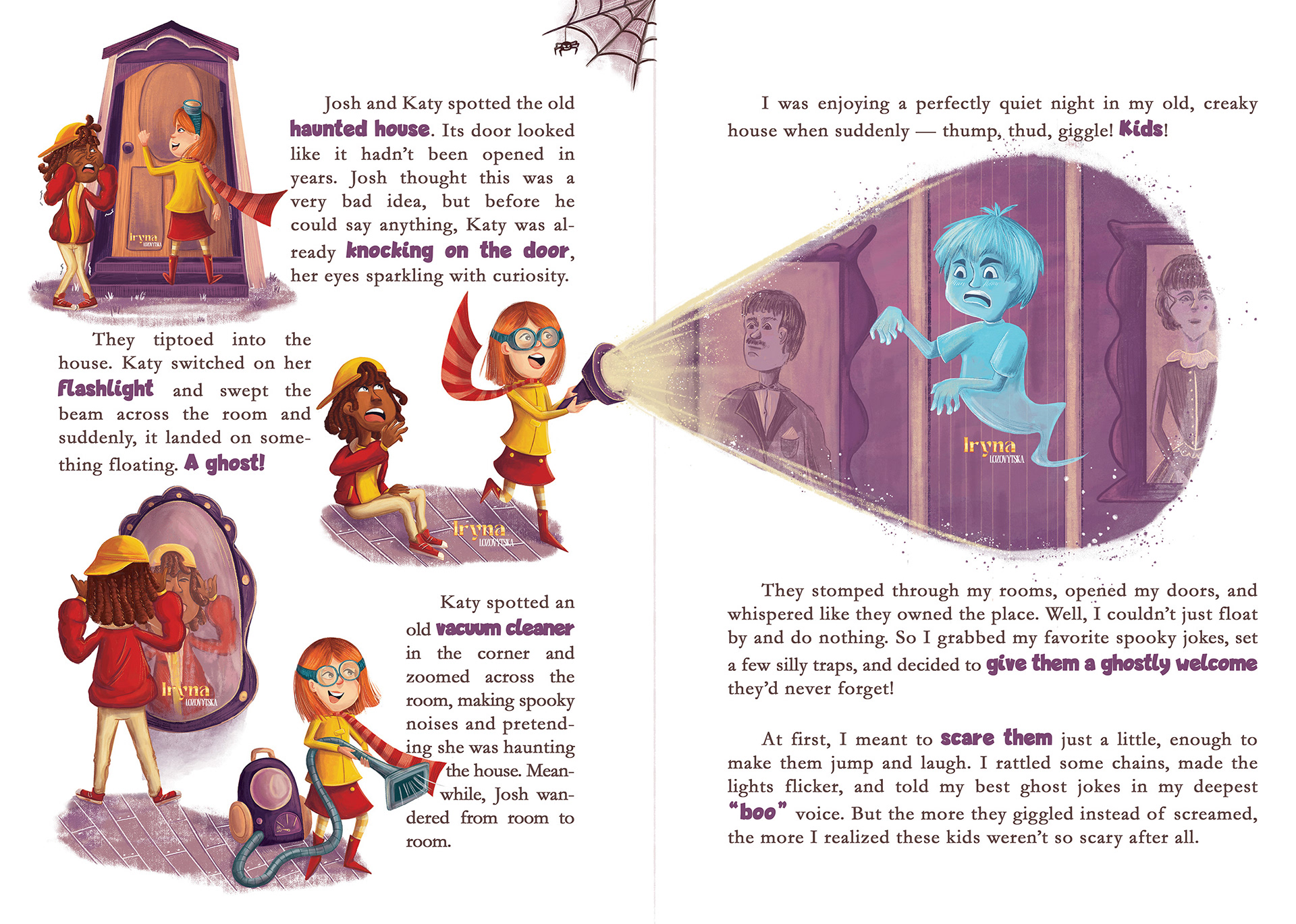
I also had the opportunity to create some interior artwork, including spot and vignette illustrations.
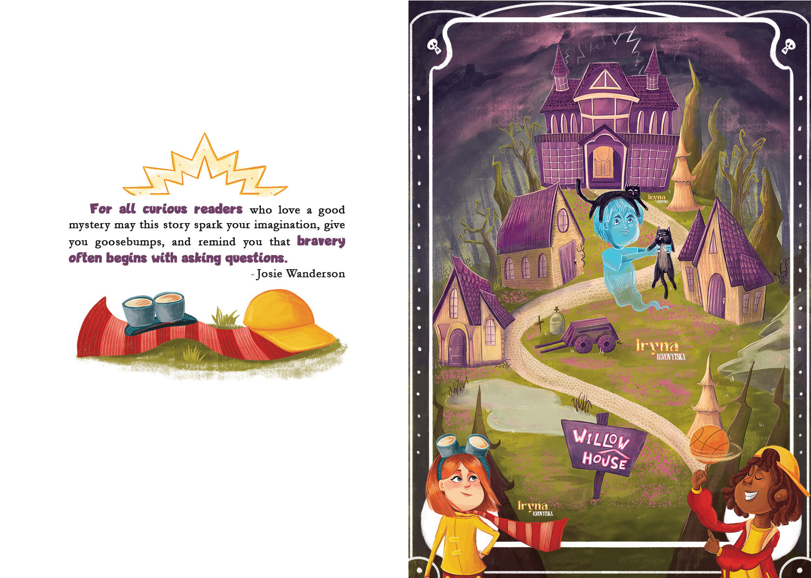
Additionally, I designed a simple map of the land where the haunted mansion is situated.
Thank you for your attention!